We pride ourselves on being a state-of-the-art company, but we also know how frustrating technology can be. It seems like the minute you’ve mastered a computer program, the software company launches an updated version with new features to learn. Our designers are up to date on the latest program versions, and are happy to help with any questions you may have.
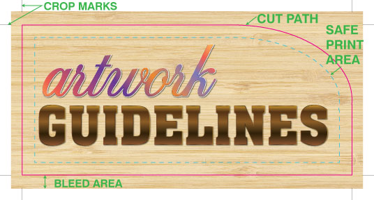
Here we’ve compiled a list of helpful hints and resources for setting up files and getting it right the first time. Please review the File Saving Guidelines & Accepted Formats prior to sending artwork. This outlines the best types of files to send, and how to set up correct bleed and crop marks.
File Saving Guidelines & Accepted Formats
Our team of professional Graphic Designers is here to help and can offer advice and assistance when needed. We also offer design services at a competitive rate.
Guidelines For Saving An Electronic File: *** NEW for 2016 ***
WE RECOMMEND SENDING A PDF FILE SAVED AT PRESS QUALITY.
The art board should be desired finished size, no bleeds or crop marks.
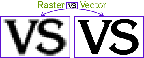
A vector file is highly recommended for a crisp, clear print.
The following applications are fully supported:
Adobe PDF
Adobe Photoshop
Adobe Illustrator
FILE TYPES: A PDF is most highly recommended, along with Adobe Illustrator, AI or EPS. Photoshop, TIFF, JPEG may be used if they are created at a high resolution. Images from the internet are typically LOW resolution and not useable for large format printing, and may be subject to copyright.
InDesign: Please send a press quality PDF of your final InDesign file, with art board sized to desired cut size. No bleed is necessary. PLEASE OUTLINE ALL FONTS in case we have to reopen in Illustrator. We work in PC format, and cannot use a TTF from a Mac. Do not send the original InDesign file – we cannot print from this or make edits.
CROP MARKS & BLEED: We have upgraded our technology and these are no longer necessary- our RIP software does it for us.
DO NOT save with color bars, registration marks, or any other printer markings.
FONTS: Please convert all fonts to OUTLINE or paths, or include all associated fonts with the file. This is important even with PDFs, in the event we need to open it in Illustrator.
COLOR: Our digital printers support CMYK color space, and the Pantone Process Coated color palette.
CUT VINYL & CUSTOM CUT SHAPES: A vector file is mandatory. These file types include EPS, Adobe Illustrator. The artwork must be the original vector drawing, it cannot be a raster image saved as these file types. If you do not have access to this artwork, our designers can assist you.
RASTERIZED IMAGES: Should be in TIFF or JPEG format, CMYK color, at a resolution of 300dpi at the actual size of the print. For very large files, 300 dpi at 50% scale is recommended, or a minimum of 150 dpi at full scale. Text and Logos are always recommended to be vector based.
FILE TRANSFER:
Email
Upload to our FTP (See: Products and Services > Send a File)
Dropbox or We Transfer
USB Flash drives
CD or DVD
Please call 800 339-1050 or e-mail order@ instantsign.net if you have an application that is not noted here.
Graphic Support
In this section, you’ll find useful information to help you stay current with the ever-changing landscape of graphic design programs. As new versions are released, you’ll find updated information here to help you continually sharpen your skills.
If you’d like to see resources added for any graphic design applications that are not listed here, please let us know.
Building a Font Library
Fonts are to printing what specialty accessories are to car enthusiasts. If used properly, they can really add a touch of class. When used in excess, however, they can turn into fuzzy dice and gaudy chrome hubcaps. From the days of the monks and their elaborate manuscripts to the thousands of font styles available today, people have always needed to vary the look and feel of their writing. Sometimes it’s merely a matter of taste, but the letters can also establish the tone of the content.
It’s a fact that there is a deep connection with the way letters look and what they actually say. That’s why many people spend a lot of time deciding exactly which font suits their document. Changing the style of the font from the standard Times New Roman to a scripted font can add a personal feel, while a more simplistic font such as Arial can suggest a more direct approach.
Trying to locate the right font can be a time consuming process. Sometimes, despite a valiant search, it can be impossible to locate the right font for a particular job. When this happens, it’s important to have a number of references available.
If you want to start building a font library, or add to your existing fonts, there are a few things to keep in mind. You should first start by removing the fonts that you never use. They take up valuable disk space and require additional installation time each time you boot up your computer. Too many unused fonts can also make searches far more tedious.
After purging your collection of unused fonts, you start looking for specific font styles that you like. One of the best ways to build a font library is to purchase font collection CDs. They’re a convenient resource, and you can browse through the collection at your leisure without loading the entire CD on your computer. Some font collections even come with a printed reference book showing examples of the fonts, which is much easier than just highlighting text and experimenting in a word processor.
Another good place to look for fonts is the Internet. Typing in the word “font” into any search engine is certain to bring up several good sites with fonts you can download for free. One excellent site for finding new fonts is www.acidfonts.com. They have many new releases, and several site links to other freeware font sites.
When you begin looking for fonts, you’ll discover two main file extensions; .fot and .ttf. These respectively stand for Font and True type font. The regular .fot extension is for fonts that aren’t too graphically intensive, and are perfect for standard word processing and text manipulation. A True type font is usually used in more graphic design projects due to their more artistic nature. True type fonts are generally more artistic and varied in style.
You should gather fonts in two separate folders on your hard drive. One should be for “permanent” fonts, or those which you use most often. The other should be labeled “temporary”, for fonts used only on current projects. Remember not to overload your hard drive with an enormous font library. You should consider alternate forms of storage such as CD, Zip or a document server.
Also, don’t forget to include your fonts on the transfer disks that contain your job files. With so many variations of fonts available, it’s always safest to provide your own.
Choosing new fonts and using them intuitively is a knack, but once mastered, it can be an effective way of communicating. However, no matter how great the font, it shouldn’t be expected to compensate for a lack of content quality. The main thing to remember is that fonts should be used as an enhancement to your writing, not the cornerstone.
Developing Effective Logos
Sharing Your Vision
Logos have a unique way of catching attention and lodging themselves into our subconscious. As a business owner or the head of an organization, that’s exactly where you want to be — inside your customer’s head.
A good logo design should reflect the universal feeling of your company. Ask yourself, what is the most important service we provide to our customers, who are we trying to attract and what is the most important feature of our business? Businesses developing designs should contemplate the answers to these questions in order to articulate they want their business logo to say.
There are several concepts to take into account when designing a logo. They include the visual aspect, as in the elements of the design, the principle aspect, as in what will evoke emotion and the illusion aspect, as in what message will this deliver subconsciously to my customer.
As many businesses have not studied these aspects extensively, it can be wise to look to graphic professionals for assistance. They will be able to assist you in meeting your needs while considering your budget, time constraints and usage.
Make It Last
We’re bombarded with visual images everyday. Your job as you design a logo is to make yours stand out. With some professional assistance, you will be more knowledgeable in helping design your logo if you keep in mind the following rules.
Color matters. Different colors evoke different emotions — a pastel yellow reflects a more serene and calming feeling as opposed to a vibrant red, which may indicate excitement and enthusiasm. Every company has their own message, so find a color that fits yours.
Your logo should lend itself a variety of digital and printed formats, including business cards, letterhead, Web sites and external signage. Simplicity can take you far in this respect. A design using ten colors may look stunning and very detailed, but it will also be costly and impractical for everyday use.
Traditionally, logos will bear fewer colors and embrace a familiar shape that tells the story. Curved lines evoke emotion and action while straight lines tell the tale of a more serious, technical company. Using these techniques in various combinations can yield a message of strength and progress.
Your target audience, as with any form of communication, should provide the primary directives in your design. A younger age group tends to be more creative and impressed by flashy designs while the older generations may prefer something more stabile and familiar. Gender differences also reflect different styles. In order to attract members of both sexes, you need to be able to see through the eyes of men and women alike.
No one likes to feel puzzled. If your audience spends too much time trying to decipher out your design, chances are they forget who you are and move on. A professional will take these factors into account and help you design something unique that can stand the test of time.
Fonts & Typesetting
The advent of desktop publishing has provided graphic artists with a seemingly endless collection of digital fonts to work with. Designers can also manipulate these fonts to create additional typographic forms. They can be layered, extended, overlapped or condensed, just to name a few. Although this is a dream for designers, these advanced typographic fonts can make it difficult to comprehend or even read the content of a printed document.
The word font originated from the word foundry, relating to the location that type was cast, and has since evolved to mean that which represents the characters in a font. Fonts or typefaces are collections of characters. Characters are the smallest forms of the written language, in other words, separate letterforms. Whereas a character represents the printed image, a glyph represents the shape of each character.
Fonts are measured in points. Designers can manipulate point spacing using either kerning or leading, or both. Kerning adjusts the spacing between the letterforms and leading adjusts the spacing between the lines. This allows a designer or printer to manipulate spacing or create different effects without changing the font. In addition to spacing, there are three main typesetting styles used when printing — justified left, justified right and centered.
Wrapping the text around a visual is another typesetting option. Typestyles include two main categories: serif and san serif. Serif fonts have small hats on the letter edges and san serif fonts do not. For example, serif fonts include Garamond, Times New Roman, Palatino, Lucida Bright, and Courier. San serif fonts include Arial, Chicago, Geneva, and Monaco. In addition, both serif and san serif fonts can either use bold or italic styles. In conclusion, a font is a complete set of letters, numbers and punctuation marks. Size, spacing, and alignment provide additional arrangements for the font in a printed document.
Guidelines for Font Usage
Presentation is crucial to all forms of communication — most of all when dealing with written communication. Unlike information conveyed personally, a written message is static. It must speak for itself. To achieve truly effective communication, one must pay equal attention to content and presentation. In written communication, the fundamental presentation element is the font.
When utilized well, a font can accomplish four things: 1) focus attention, 2) enhance readability, 3) establish a tone, and 4) project an image. Your font is the first line of defense against reader apathy — and your first chance to capture an audience and create a positive, lasting impression. To be effective, fonts should be chosen carefully and strategically. The following is a brief digest of useful font guidelines.
1. Watch Your Case
The body of most documents should use upper and lowercase text. Avoid using all upper or lowercase text anywhere in your document, as both can be difficult to read. As for headings and titles, use uppercase lettering whenever prescribed or appropriate.
2. Size Does Matter
Generally accepted writing guidelines for typical documents prescribe the use of 10-12 point font for the body, 14-48 point font for primary headings and one-half of the primary heading point size for secondary headings.
3. Keep It Simple
Simplicity is a virtue in writing. Keep this in mind when choosing a font or font mix. Remember, your font is supposed to enhance your message, not upstage it. Unless it is truly warranted, tend toward simple, inconspicuous fonts like Times New Roman or Arial. Also, these fonts, among others, are TrueType — this means that what you see on the screen is exactly what you will see on the page.
4. Be Consistent
Don’t overdo it by using three or four different styles in the same document. As a rule, never use more than two fonts in the same piece. Like the saying goes, two’s company, three’s a crowd. So once you choose your fonts, be committed and use them throughout.
5. Mix It Up
Though you should use no more than two fonts in a single document, variety is sometimes needed to break the monotony. A good way to add variety is through the use of italicized, bold or underlined text. These tools, when properly used, can signify importance, emphasis or even inflection. Just remember to use them sparingly.
6. Match Your Medium
The goal of every project is different, as is the intended audience. Accordingly, there isn’t one best font or style. The characteristics of your project should determine which font is right. When it comes to style, the above should be treated as guidelines, not gospel. If you need uppercase text, use it. If you need an additional font for a breakout section, add it. Ultimately, the most important thing is that your presentation matches your medium.
Preflight Preparation
Preflight preparation is the process of collecting, updating and sending files or applications to a printer for production. Preflight preparation uncovers missing data or fonts, misplaced illustrations, trapping errors, incorrect sizing and other important details. The first thing to include is the primary document, whether in Illustrator, PageMaker, QuarkXPress or Photoshop. Check with your printer to ensure they have the current version of the software you’re using. If there are compatibility problems, you may need to submit a PostScript file or PDF for output.
Be sure to include all fonts with the documents you submit. The printer may not have a specified font, so include the screen and printer fonts, in addition to bold, italic and other versions. Include additional font dingbats or end-marks as well. Most printers use Type 1 fonts or TrueType fonts; ask which is preferred before submitting your files. Type 1 and TrueType fonts use different kerning and spacing methods. Using the wrong version can damage the text flow and layout.
Include hardcopies of the illustrations, images and photographs with the application file. Use EPS or TIFF images and change RGB colors to CMYK. Label each graphic and make sure all files are uncompressed. GIF images have low resolution and RGB format is not used in color printing. Avoid using GIF, JPG, WMF, BMP and PICT formats in files sent to your printer.
CMYK: a four-color process using a percentage value of the colors cyan, magenta, yellow and black.
RGB: a three-color process using values of the additive colors red, green and blue, producing visible light.
SPOT: a one-color process using percentages of full color and the tinting, screening or shading of additive colors.
Ask what formats and files are preferred by your printer. Standard floppy (3.5 inch) disks are generally used for small or compressed files. ZIP disks, CD-ROMs, Bernoulli cartridges or Magneto-Optical disks are used for large files and graphics. Sending files via the Internet as e-mail attachments is another alternative. Compressing the files first will speed up the transmission.
Include a hardcopy of each file to eliminate the problem of missing graphics, illustrations or text information. Send the document at 100% of the printed size or include the percentage size. Include a list of the fonts and files on each disk or cartridge. Put together a mock-up of how the document will be printed and bound as a sample. On the disk, include a label with your name, address and phone number.
Raster Images vs. Vector Graphics
Computer graphics can be created as either raster or vector images. Raster graphics are bitmaps. A bitmap is a grid of individual pixels that collectively compose an image. Raster graphics render images as a collection of countless tiny squares. Each square, or pixel, is coded in a specific hue or shade. Individually, these pixels are worthless. Together, they’re worth a thousand words.
Raster graphics are best used for non-line art images; specifically digitized photographs, scanned artwork or detailed graphics. Non-line art images are best represented in raster form because these typically include subtle chromatic gradations, undefined lines and shapes, and complex composition.
However, because raster images are pixel-based, they suffer a malady called image degradation. Just like photographic images that get blurry and imprecise when blown up, a raster image gets jagged and rough. Why? Ultimately, when you look close enough, you can begin to see the individual pixels that comprise the image. Hence, your raster-based image of Wayne Newton, magnified to 1000%, becomes bitmapped before you can isolate that ravenous glint in his eye. Although raster images can be scaled down more easily, smaller versions often appear less crisp or “softer” than the original.
To maximize the quality of a raster image, you must keep in mind that the raster format is resolution-specific — meaning that raster images are defined and displayed at one specific resolution. Resolution in raster graphics is measured in dpi, or dots per inch. The higher the dpi, the better the resolution. Remember also that the resolution you actually observe on any output device is not a function of the file’s own internal specifications, but the output capacity of the device itself. Thus, high resolution images should only be used if your equipment has the capability to display them at high resolution.
Better resolution, however, comes at a price. Just as raster files are significantly larger than comparable vector files, high resolution raster files are significantly larger than low resolution raster files. Overall, as compared to vector graphics, raster graphics are less economical, slower to display and print, less versatile and more unwieldy to work with. Remember though that some images, like photographs, are still best displayed in raster format. Common raster formats include TIFF, JPEG, GIF, PCX and BMP files. Despite its shortcomings, raster format is still the Web standard — within a few years, however, vector graphics will likely surpass raster graphics in both prevalence and popularity.
Unlike pixel-based raster images, vector graphics are based on mathematical formulas that define geometric primitives such as polygons, lines, curves, circles and rectangles. Because vector graphics are composed of true geometric primitives, they are best used to represent more structured images, like line art graphics with flat, uniform colors. Most created images (as opposed to natural images) meet these specifications, including logos, letterhead, and fonts.
Inherently, vector-based graphics are more malleable than raster images — thus, they are much more versatile, flexible and easy to use. The most obvious advantage of vector images over raster graphics is that vector images are quickly and perfectly scalable. There is no upper or lower limit for sizing vector images. Just as the rules of mathematics apply identically to computations involving two-digit numbers or two-hundred-digit numbers, the formulas that govern the rendering of vector images apply identically to graphics of any size.
Further, unlike raster graphics, vector images are not resolution-dependent. Vector images have no fixed intrinsic resolution, rather they display at the resolution capability of whatever output device (monitor, printer) is rendering them. Also, because vector graphics need not memorize the contents of millions of tiny pixels, these files tend to be considerably smaller than their raster counterparts. Overall, vector graphics are more efficient and versatile. Common vector formats include AI, EPS, CGM, WMF and PICT (Mac).
Vinyl Lettering Installation
SURFACE PREPARATION
All surfaces should be considered dirty and should be cleaned prior to application of vinyl lettering or graphics. Wipe dust off of painted surfaces. Clean the area where the vinyl will be applied. Windex is fine to clean glass then dry the window area.
APPLICATION (PRE MASKED BY INSTANT SIGN)
Horizontal Hinge Method:
1. Position lettering on the area in the desired location. Tack to desired location with small pieces of masking tape on either end.
2. Apply a long piece of masking tape across the top of the lettering or graphic.
3. Remove small pieces of masking tape at both ends.
4. Lift up the lettering from the bottom and remove release liner. Holding from the two bottom corners and keeping the sheet as flat and wrinkle free as possible place the lettering on the glass.
5. Squeegee each section into place with smooth downward strokes.
6. Re-squeegee entire line of lettering or graphic when complete.
7. Remove application tape Remove application tape
YOU’RE ALL SET!
Quick Tips
In this section, you’ll find a variety of tips and tricks to help you better understand our industry and to build your base of knowledge on a wide range of topics.
If you have ideas on other tips you’d like to see added here, please let us know.
Copyright Laws
Copyright laws protect original works of expression including, but not limited to, novels, short stories, fine and graphic arts, photographs, software, films, paintings, and recorded musical performances. For copyright laws to protect a work of expression, it must be original and an independent, creative effort of its author. Then, depending on when the work was created, the copyright law will protect it.
Copyright law has specific guidelines for the length of protection it provides to a copyright owner. There are five main categories:
1. Works published in the United States before 1923 are public domain.
2. Works published after 1922, but before 1978, are protected for 95 years since the date of publication.
3. Works created, but not published, before 1978 last the life of the author plus 70 years.
4. Works published after 1977 last for the life of the author plus 70 years.
5. Works published for employment, commission, anonymously, or while using a pseudonym, last between 95 to 120 years.
Copyright is a legal device an author has to control how his or her published work of art or literature is used. Copyright rights are solely for the author, unless he or she transfers those rights to another person. The Copyright Act of 1976 provides exclusive rights to the reproduction, distribution or adaptation of the works to the author. This act states a work must be “fixed in a tangible medium of expression” or, in other words, the work must exist in some form, no matter how short the time frame or the format.
Copyright laws prevent the unlawful use of original works with the owner’s written permission. If someone were to reproduce copyrighted material without the owner’s written permission, the owner could sue. There are minor exceptions to this circumstance, for example, the fair use rule. The fair use rule, under copyright law, allows others to use another author’s work without asking permission.
Using research information in a new work is an example of the fair use rule. Often it is imperative for an author to quote a short section in a scientific work to illustrate an observation. In addition, quoting a work in a review, to illustrate a point or to comment, is fair use. Professors and teachers use the fair use rule when photocopying text or excerpts for classroom assignments or readings.
Violations often occur when the use is motivated primarily by a desire for commercial gain. The fact that a work is published primarily for private commercial gain weighs against a finding of fair use. Unless the fair use rule clearly applies to a publication, you should review the owner’s rights and request written permission.
Fair Use Rule
The Fair Use Rule, a component of copyright law, allows individuals to use an author’s work without their direct permission. This hinders the copyright owner’s rights to a small degree, but doesn’t lessen their protection under the law. Professors, authors, printers, photographers and publishers should understand what constitutes fair use, and what spells a copyright law violation. This list is not self-contained, as most writers, students or scholars use quotes or paraphrase ideas in other published works.
The primary factor in in determining fair use is whether copyrighted materials is copied verbatim or used to create a new work, often described as transformative. Transformative works use protected material to create a new angle or take on a topic. The more transformative, the better. Questions relating to copyright law and fair use can be redundant, but the misinterpretation of each could be serious. Quoting or paraphrasing without an author’s written permission, regardless of the fair use rule, can lead to a lawsuit.
Most often, fair use violations occur when someone misuses an author’s words for commercial gain. For example, let’s say a printing business decides to produce a brochure about paper production and distribution. They prepare original copy for the paper production section, but paraphrase another printer’s brochure for the distribution section. That’s not fair use. In order for it to be fair use, a printer needs to either create entirely original content for the brochure, quote the referenced material or use the other printer’s information to create a new angle on the topic distribution.
Using research information in a new work is an example of the Fair Use Rule. Often it is imperative for an author to quote a short section in a scientific work to illustrate an observation. In addition, quoting a work in a review, to illustrate a point or to provide comment, is fair use. Professors and teachers use the Fair Use Rule when photocopying text or excerpts for classroom assignments or readings. However, unless it’s absolutely clear that fair use applies to a publication, you should check the owner’s rights under copyright law and request written permission.
Rules for Legal Advertising
So what determines if an advertisement is unlawful? If it misleads or deceives consumers, it is considered unlawful. Both federal and state laws regulate advertising in conjunction with the Federal Trade Commission. Furthermore, the FTC doesn’t have to prove that an ad deceived even one consumer, just that it has a deceptive characteristic or approach.
To ensure that an advertisement isn’t deceptive or misleading, start with:
– Is the information in the advertisement accurate?
– Do I need written permission to print a photo or use an endorsement?
– Can I meet the demands of the advertised sale?
However, that’s just the beginning. What can consumers expect from a product or service? For example, advertising that photo paper is fade-resistant is accurate if it never fades. But if it fades, it can be considered misleading. You have to be specific. There’s a huge difference between paper being fade-resistant for five years as compared to ten. Exaggerating a product or service is a form of deceptive advertising.
U.S. copyright law protects copyright owners through the Fair Use Rule and provides advertisers with access to copyrighted works without fear of being sued. Fair use allows advertisers to use limited quotations from copyrighted works without the specific authorization of the copyright owner. Product or service reviews also provide quotes to advertisers, but, to be certain, check the copyright restrictions. You should request written permission to use the quote or information.
Misleading consumers about a competitor’s products or services is an advertising violation. Inaccurate information that damages a competitor’s reputation is unlawful according to FTC guidelines. You should carefully review all advertising to make sure that business-to-business comparisons are accurate.
State law can require businesses to stock an advertised product, or to provide a service, in quantities prepared to meet the expected demand. For example, a business that advertises cameras on sale needs to have a reasonable amount in stock, or include a disclaimer such as while supplies last or limited stock. Each state has different demand laws, so check before advertising a product or service on sale.
Deceptive pricing is another FTC violation. Be honest about the sales and savings. For example, a business that advertises computers at $1000 and compares it to a doctored price of $1200 is practicing deceptive pricing. In addition, be specific about credit terms. Credit terms include the down payment, the terms of repayment, and the annual interest rate. Do not guarantee credit to consumers if there are hidden terms or restrictions.
Businesses advertising free products or services need to be upfront, and state the limits, terms or conditions. For example, a business offering a free pen to consumers who purchase a calculator for $10 is advertising a free pen. However, if $10 is more than the usual calculator price, the hidden cost means the pen isn’t free.
Federal and state governments can investigate businesses violating the Federal Trade Commission’s advertising laws. Often investigations are conducted by the Attorney General, Consumer Protection Agency or local District Attorney. The FTC trusts consumers and competitors to report unlawful advertising. Consumers and competitors can also proceed against the advertiser without the FTC. To avoid the cost and trouble associated with these actions, it’s important to ensure that advertising does not mislead or deceive consumers.
Trademark Laws
Trademark laws protect specific words, phrases, domain names, slogans, logos and other symbols used to distinguish between different brands on the market. A trademark allows consumers to identify a specific brand in the marketplace, because most consumers use trademarks to make purchasing decisions. Federal and state trademark laws protect the duplication and misuse of a brand and its reputation.
Subdivisions to the trademark laws are labeled service, certification and collective marks. Service marks promote services and events, whereas trademark laws promote products. For example, when a business advertises its name and service or product in the yellow pages, it’s considered a service mark. Certification marks, on the other hand, are used to support a particular product or service, such as a seal of approval.
Collective marks are symbols, labels, words or phrases used to mark goods, members, services or products. This is often used to show membership in a union, association or other organization. Four other considerations of collective marks are regional origins, manufacturing methods, product quality and service accuracy. Denver Paper, a paper production business in Denver, Colorado, is an example of a collective mark of regional origin.
Before registering a trademark, a trademark search must be conducted. This can be done at the Web site of the U.S. Patent and Trademark Office, or by visiting the Patent and Trademark Depository Library located in each state. Conducting a trademark search is a critical first step in ensuring that your trademark name is unique.
Once you register a trademark, you must take steps to protect it. Trademark owners can file a lawsuit against violators to protect their service or product. Most trademark lawsuits are filed to either prevent a registered trademark from being misused (leading to consumer confusion), or to recover damages from those who misused a trademark. In addition, there are federal statutes protecting trademark owners under the Lanham Act. Each state has its own statutes that protect trademarks within the state’s boundaries.
Copyright, another form of protection, is a legal device an author has to control how his or her published work of art or literature is used. Trademark and copyright laws can be used in conjunction to protect a product or service. For example, the copyright laws protect the artistic characteristics of a business logo, and the trademark laws prevent other businesses from using the logo in the market.
Tech Tips
Keeping up with technology is kind of like driving your Volkswagen Beetle across the country. Every time you start to get anywhere, you have to stop and fill-up. Technology changes so fast, we have no choice but to continually re-educate ourselves. This section includes technology tips that will help you stay on top of trends. Check back often, we’re always adding new content.
If you have ideas regarding technology resources you’d like to see added here, please let us know.
File Compression
At one time or another, every computer owner has run into the problem of large files, and insufficient hard drive space. Despite thinking that you would never run out of space when you purchased your computer, you’ll soon find that the applications and documents can quickly consume a hard drive. Before you know it, your computer is prompting you that disk space is running low.
One effective method to combat limited disk space is to utilize a simple compression program. The function of a compression program is to take large files and make them smaller without changing or losing any information in the file. It does this by using a complex set of algorithms and equations that reduce the size by reorganizing the bits of information in the file. When a compressed file is expanded, the bits of information are rearranged to put the file together.
Like everything in the computer world, there are many different compression application to choose from. Even though each program uses different algorithms for their compression, their compression levels are comparable. A typical compression rate for a 100k Word document containing all text is about 60%-90% of the original file size. With this in mind, choosing your own favorite compression utility is usually a matter of personal preference.
One of the most common, and user-friendly programs is called PKZIP. This program is freely available from www.PKware.com. It’s user interface combines functionality with ease of use by putting the compression terminology into easily understood terms.
Another highly used compression utility is called RAR. The RAR compression format is extremely useful for packing together large programs into one very small file. It can take extremely large files and spread them out over several smaller files which can be easily transferred or stored on individual floppy disks. This program is also free to the public at www.RARsoft.com.
Another extremely popular shareware compressing agent is called ARJ, and can be found at www.ARJsoft.com. This program has all the same capabilities as RAR and PKZIP, but uses a different format and file extension.
With the various compression utilities out there, it’s nice to have more than one around so that you can access other people’s compressed files. You can only expand a file with a .zip extension using PKZIP. A file with the .arj extension can only be opened with ARJ, and the .rar extension can only be opened with RAR. Most files available on the Internet come compressed in one of these three above formats, and some sites offer various compression formats so you can select the one you prefer.
With files sizes ever expanding and online file transfer an important part of business today, compression allows us to save valuable disk space and time. Once you familiarize yourself with common compression formats, you can cut large files down to size in a matter of minutes.
File Transfer Times
As technology continues to advance, Internet users have become increasingly accustomed to fast connection speeds. Although download times are affected by many variables, the most critical is the connection speed of both parties. Not all modems, though, are created equal. Some are fast and some, though once considered fast, are now very slow. Commonly-used modems range the gamut from 28.8 kbps analog to the 250 mbps wireless. The following is a brief comparison of various modems and the respective time required to download a 10MB file.
Modem / Transfer Rate / 10MB Download
28.8K / 28.8 kbps / 46 minutes
56K / 56 kbps / 24 minutes
ISDN / 128 kbps / 10 minutes
ASDL / 384 kbps / 3.3 minutes
Cable / 600 kbps / 2.1 minutes
T-1 / 1.54 mbps / 50 seconds
Wireless / 250 mbps / .3 seconds
Macintosh vs. the PC
Macs and PCs are like apples and oranges. Both are computers, and perform similar functions, but they look and operate quite differently. However, like apples and oranges, comparisons between the two are highly subjective. Whether to use a Mac or PC is matter a personal taste and the operations you require.
IBM named its first computer a PC, which stands for “personal computer.” A Macintosh isn’t a personal computer, but rather a “person’s computer.” Although PCs and Macs are programmed to perform similar tasks using hardware, each computer requires different software. Hardware includes external devices such as monitors, connectors, cables, consoles, speakers, keyboards, printers and a mouse. Hardware necessities include a keyboard and monitor, whereas an add-on includes a scanner. Software is the computer brain of both the PC and the Mac. Software instructs the hardware of its tasks and how to perform them.
Computers are designed to house short-term storage on the hard drive. In addition, both the PC and the Mac use disks for long-term storage. PC and Mac disks have different formats. There are two kinds of disks available to users. Floppy disks have 1.4 MB of information and zip disks have 100 MB of information storage, with MB standing for “megabyte.” Zip drives work the same floppy disk drives, but are not standard on most PCs. Mac’s have a built-in zip drive, whereas PC’s only offer it as an option.
The single-processor Mac is faster than the cheapest single-processor PC. PCs are usually less expensive than Macs and there are more PC’s on the market. For example, Gateway and Dell are two different PC providers. Another difference between the PC and the Mac is that the Mac tends to be easier to use and troubleshoot. Most PC users need to consult a computer technician when experiencing difficulties, whereas Mac users are usually able to troubleshoot without outside assistance.
Macs tend to have more consistent applications than the PC does, and those applications are pre-packaged with built-in Apple standards. PCs have more options and lower prices. The purchasing difference between PCs and Macs is that Macs have the built-in features that PCs don’t have. PC buyers must either buy a pre-packaged deal or buy computer software on their own.
Macs have the capability to read PC disks with a built-in format translator, whereas PCs need special software to read Mac disks. Mac parts are also harder to find because often they must be ordered from an Apple dealer. PCs have parts that are usually cheaper and easier to find. PCs are also easier to upgrade because their software options are separate and there is a larger selection.
Scanning Different Media
The process and applications of a scanner are relatively simplistic. It acts and functions much like a copier. It has the same little scanning bar that blinds you if you look into it, and instead of feeding paper (though a rare few do) it transmits the scanned object into your computer and allows you to alter it digitally. In that respect, a scanner can far surpass the average office copier.
Color Scanning
Scanning color pictures can be fun, but it’s also very challenging. You may expect to get the same quality and detail as the original, but that’s not always the case.
A critical part of any scan is determining the proper resolution, or dpi (dots per inch) setting. Most scanning software allows you to select from a range of settings, usually between 75-6000 dpi. Of course, individual settings depend on the quality of the scanner you’re using, and technological possibilities are expanding all the time.
Generally speaking, the greater the dpi (or higher the resolution), means a better quality scan. It also means that you’ve created a larger file. A typical 400 dpi color scan can be as large as two megabytes, whereas a 100 dpi black and white scan is somewhere between 50-100 kilobytes. There is also a major difference in the smoothness of color shading. The edges of the scanned picture become more jagged and irregular when using a lower resolution setting.
The advantage to scanning in pictures at a lower resolution is that the files are not as large, and can be easily attached to an e-mail or saved to a floppy disk. A 400 dpi file takes a long time to transfer on a slower machine, and is too large to fit on only a single disk. The disadvantage, however, is that the lower resolution creates a lower quality picture. Photo images found on the Web are usually scanned at 72 dpi. While they look great on your screen, these photos will not print on a color printer very clearly.
Black & White Scanning
In scanning black and white text or photocopies, the concern over resolution is not as great. Whether it’s photos or text, contrast is just as important as resolution. Sometimes you’ll need to darken the black or grays to add contrast against a white background. Adjusting contrast can cause otherwise unnoticeable scratches or particles to appear. Using Photoshop, you can easily increase or decrease contrast once a scan is completed.
Another thing to be aware of is the quality of the original you are scanning. The scanned picture can never be better than it’s original, and you must keep in mind that there are always minor deficiencies, scratches, or other imperfections that will be enhanced by the scan. Keeping the glass on your scanner clean, and double-checking for wrinkles, smears and other debris on the original will usually lead to a high-quality scan.
In scanning different kinds of media, the best thing to do is experiment. Once you have some of the basic principles down, you’ll start to see more and more ways to apply them, and even begin to think of new things you might want to try. Play around with scanning objects other than pictures or documents. Most mid-range scanners can capture almost anything that will fit on the glass. Just keep trying different things and don’t get discouraged if success is slow to come. Proper scanning techniques can take years to refine.
Selecting Domain Names
Deciding to go online is definitely an important step; but it’s only one of many. After making the initial decision to go “virtual,” the next and possibly most important step is choosing a name for your Web site. In Web parlance, this is referred to as selecting a domain name. Name recognition and recall is an e-commerce imperative. The following are some tips for selecting an effective domain name for your organization or business:
Keep it Legal
Domain name length should fall somewhere between 2 and 63 characters, not including the top level extension — traditionally .com, .net or .org. The only acceptable characters are the letters A-Z, the numbers 0-9 and hyphens. However, domain names cannot start or end with a hyphen. As well, domain names are not case sensitive and are generally displayed in all lowercase letters.
Once you’ve selected a name and confirmed its availability, you must also make sure it doesn’t infringe on any existing trademarks or intellectual property. Simply being available does not make a domain name legal.
Make it Appropriate
Consider your target audience when selecting a domain name. What is the purpose of your Web site? What tone should it take? Perhaps it should be formal, or informative, or even sarcastic. Consider whom you intend to attract and what will capture their attention.
Keep it Simple
Keep your domain name short and sweet. Generally, a shorter domain name is easier to remember, write down or repeat frantically in your head while sprinting to the nearest computer. Remember, as length increases, so does customer confusion. That being said, try to restrict the domain name to one, two or three words maximum. Try to select easily-spelled, easily-pronounceable words with few syllables. Although they’re available, avoid using hyphens to separate words. Also, avoid acronyms unless they’re part of your name. Whereas “qmfc” is short, may not be easy to remember.
Make it Evocative
Domain names are especially effective when they create strong visual associations — strong and relevant visual associations. Name recall is promoted when a consumer can connect a specific and unique image, memory, scent or individual with your domain name. Take the word “banana” for example. You know how bananas look, smell, taste and feel. Make it something concrete and certain. Like www.deathandtaxes.com.
Make it Easier
To facilitate your search, log on to Network Solutions (www.networksolutions.com), or use a program such as Mozzle (www.mozzle.com), or Domain Questor (www.internet-soft.com). These services, as well as many available freeware and software tools, can be invaluable. For example, Mozzle contains an automatic thesaurus, acronyms, alternative domain name spellings, trademark searches, pattern searches and so on.
Make it Universal
Be wary of ethnocentrism when creating a domain name. If your site is targeted to a global audience, take into account the fundamental linguistic and cultural contrasts that distinguish your market segments. This includes slang usage, spelling discrepancies and other various geographic idiosyncrasies.
Make it Unique
Some domain names betray all practical advice and yet are still tremendously effective. Why? Because they’re unique and thus, easily remembered. Ultimately, uniqueness is perhaps the most influential predictor of domain name success. This is especially true for small to mid-sized businesses who lack instant brand recognition. The key, however, is to be both unique and relevant. Remember, like any brand name, logo or trademark in the real world, a domain name is your identity on the Web. Furthermore, if created correctly, it is a moniker that customers will forever associate with your product, service or company.
Understanding Computer Viruses
The first tenet of warfare is this: know thy enemy. So what exactly are computer viruses? Computer viruses are devious little computer programs that attach themselves to legitimate program-hosts and then engage in rampant self-replication. It’s easy to be fooled by their small size. Don’t be. They’re never small for long. Computer viruses propagate like rabbits — and by the time you first recognize their presence, your data may be permanently damaged or erased.
On this point, however, an important clarification must be made. Like biological viruses, computer viruses are not inherently destructive. You’re probably harboring a fugitive cold virus in your body right now, even if you’re not actually sick. With both biological and computer viruses, you can be infected without being affected. Your computer can be a veritable hive of viruses without exhibiting any visible symptoms or actual damage. If not instructed to do otherwise, viruses will quietly, unobtrusively and perpetually replicate. They’re only destructive if intentionally engineered to be so.
Malicious computer viruses contain a “payload” — a programming element separate from the self-replication code that executes its objectives. For example, a payload might display a personalized message on your monitor. It might erase critical data or program files, reformat your hard drive, or infiltrate your messaging software and overload the local network with authorless e-mail. But not all computer viruses are created equal. Some are full of sound and fury, yet signify nothing. Others are silent but deadly. In general, though, computer viruses are of three main types:
Macro Viruses: These are the most prevalent type of virus today. Unlike conventional viruses which can attach to virtually any program, macro viruses prey on specific programs. A macro itself is an instruction code that automatically executes other program commands. Many popular and prominent software applications utilize macros extensively. Essentially, macro viruses are macros that embed within a program and self-replicate.
Macro viruses that run on Microsoft applications like Word and Excel are particularly common — chiefly because certain programming strategies employed by these applications make them particularly susceptible. Macro viruses work like this: when an infected document is initially opened, the macro virus embeds itself in the associated application and then proceeds to attach itself to every subsequent document created. In this way, the macro virus is unwittingly disseminated whenever the user transfers a document.
Parasitic Viruses: These are the most infectious type of virus. Parasitic viruses attach themselves to executable programs like .com or .exe files. Once an infected file is launched, the virus is free to replicate itself, embed in primary memory, or release its payload. Further, it can corrupt not just specific programs, but virtually any program being processed in RAM.
Boot Sector Viruses: The boot sector is essential software that resides on hard, floppy or optical disk, and is responsible for loading your operating system into memory at the start of a computing session. Boot sector viruses penetrate this vital boot sector and alter its contents. As opposed to macro viruses, boot sector viruses are spread not by sharing documents, but diskettes. Whenever new diskettes are introduced to a previously infected computer, the boot sector virus is transferred to the healthy diskette, which then conveys the virus to other computers, and so on.
These are all considered true computer viruses. Another commonly-observed form of computer pestilence (though not literally a virus) is the worm. Worms differ from viruses in that they do not require a host to wreak their havoc. Other viruses are referred to as Trojan Horses. Trojan Horses are viruses that masquerade as legitimate programs, documents or other software, only to reveal their true function later. Trojan Horse viruses are often spread through e-mail or online bulletin boards.
Certainly no one would knowingly expose their computer to a virus. Unknowingly, however, thousands daily place their machines in peril. Ignorance is no excuse, though — an ounce of prevention is worth a pound of cure. The following are some common troubleshooting techniques for keeping your computer virus-free:
– Always rely on a reputable anti-virus software applications like Norton or McAfee.
– Always scan new files, diskettes or software before loading them on your machine.
– Always back-up critical software or files to avoid permanent loss due to infection or deletion.
– Always be wary of strange operating tics or unusual graphics.
– Always ensure vigilance from the other members on your computer or network.
– Always write-protect your system and program disks.
– Always enable Macro Virus Protection in all Microsoft applications.
– Never share diskettes or software without assuring their integrity.
– Never download e-mail or Internet files/programs without scanning them first.
– Never act on an e-mail virus alert without confirmation from an IT professional or trustworthy resource.
– Never boot your system with a diskette other than the original.
Understanding PDF Files
Adobe PDF is a dynamic and versatile file format that can dramatically simplify and expedite document viewing, transfer, storage and output. The letters P, D and F comprise an acronym which stands for Portable Document Format. Adobe PDF is widely used by publishers, Web programmers and graphic designers, and generally accepted as the preeminent format for universal document exchange. Why is it so popular? The following five attributes should provide some insight:
Compatible: PDF is a cross-platform file format. This means that PDFs can be used to recreate documents regardless of where they were originally created. Also, PDF will preserve the document’s original style and formatting (including colors and fonts) exactly as they were intended to appear. With Adobe Acrobat Reader, virtually anyone, on any platform, running any application version, can view and print identical PDF files.
Active: PDF files are highly navigable. They contain highly useful navigation tools, such as: internal and external links, structured bookmarks, search capabilities, thumbnail page views, multi-directional buttons, magnification options and more.
Accurate: PDF files are both easily viewed and output. Since it utilizes the PostScript language, the format ensures true, faithful and fast printing. Also, PDF files viewed on-screen retain precise color regardless of software or hardware variations, and also retain clarity in magnifications upward of 500%.
Convenient: PDF files are both smaller in size than original source files (e.g., potentially 20% as large as HTML files) and easier to download and view. PDF documents also offer page-at-a-time downloading, allowing you to read and revise the early pages of a document before the entirety has been received. Further, because of their economical size, you can download the whole document faster than you would a source file.
Secure: PDF offers extensive security protections. Users can assign security passwords to PDF documents before sending them to maintain strict control over sensitive information. Further, PDF files can be authenticated and secured with digital signature technology. A PDF feature known as SelfSign enables creators and users to restrict and track access to critical documents through the use of an encoded digital signature.
The preceding information should help explain the merits and subsequent popularity of PDF files. If you’re ready to begin utilizing this versatile format, it won’t take much to get started. The following are the five primary methods for creating PDF files.
1. Adobe Acrobat: software used to create and modify PDF files. Allows users to create a PDF file by simply dragging a document into Acrobat, choosing the format directly from Microsoft Office, or converting documents directly, among other methods.
2. Adobe PDF Writer: software that mimics a printer driver to create PDF documents from nearly any Windows application.
3. Adobe Acrobat Distiller: software for automated, high-volume conversion of PostScript files to PDF.
4. Adobe Acrobat Capture: software designed specifically for the conversion of scanned image files to PDF, optimized for character recognition and clean-up.
5. Other software: other Adobe graphical and publishing software such as FrameMaker, PageMaker and Illustrator can be used to automatically create PDF files. Also, a surplus of third party software like EZ-PDF, ActivePDF Printer and QuarkXPress offer PDF creation capability.
Forms
Below you will find a list of forms pertaining to prospective employees and clients (including work sheets listing the information we will need to get started). Please feel free to download, browse, and call with any questions.